Final Project- Magazine Cover
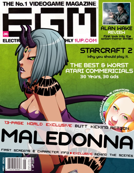
This is a imaginary cover for Electronic Gaming Monthly. I am currently working on a video game called Maledonna and this would be the best thing to happen to the game! It is an all-girl fighting game and the character on the front is the boss of the game. (The image is drawn by me, by the way) I am working on this game on my own and I can't wait for the day when i can release it!
Anyway, I went online and found the EGM logo and used it for this cover. I also took a look at a lot of their covers and tried to duplicate how they construct their covers. I also tried to find their exact text, but I had to settle for the one I used since it looked the closest. I also went to the Website and found articles they have on the site currently to use as titles on the magazine.
The construction of the cover was relatively easy as it was mostly text. For the background, I used an image of my own and did the stroke feature to make the black outline. I used a gradient from lime green to blue for the background and for the texture I went to cgtextures.com and found a splatter texture and a dried dirt texture. I put the textures on separate layers, set the layers to multiply, and lowered the opacity to where I wanted it. Outside of that, a lot of the work was in moving and resizing the text until I was satisfied.
Assignment #4- Typographic Poster
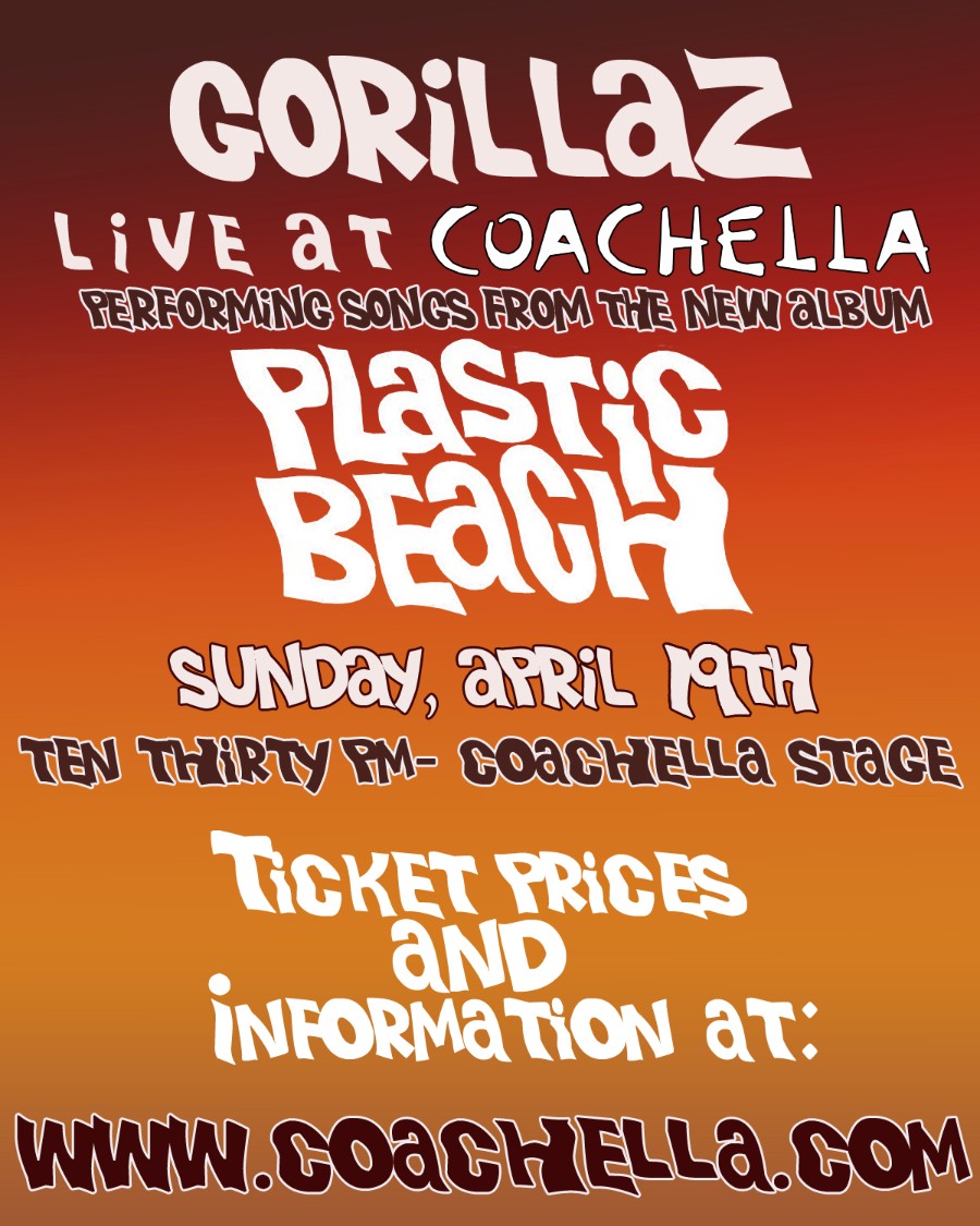
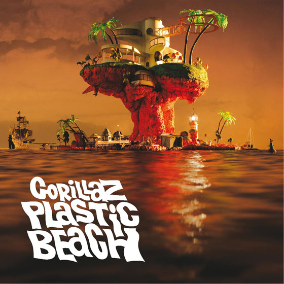
I've been listening to the new Gorillaz album for the past week so I guess it was only natural that I would choose them as my subject for this project! I managed to find a text from their new album and used that for this poster. I looked up where their next concert would be and they are actually performing tonight at Coachella, so I chose that for the venue. I picked the colors for the background straight from the new album cover as well. For the outline effect on the text, I used the stroke feature under layer effects. Below is an image of the album cover for reference.
Assignment #3- Abstract Color Art
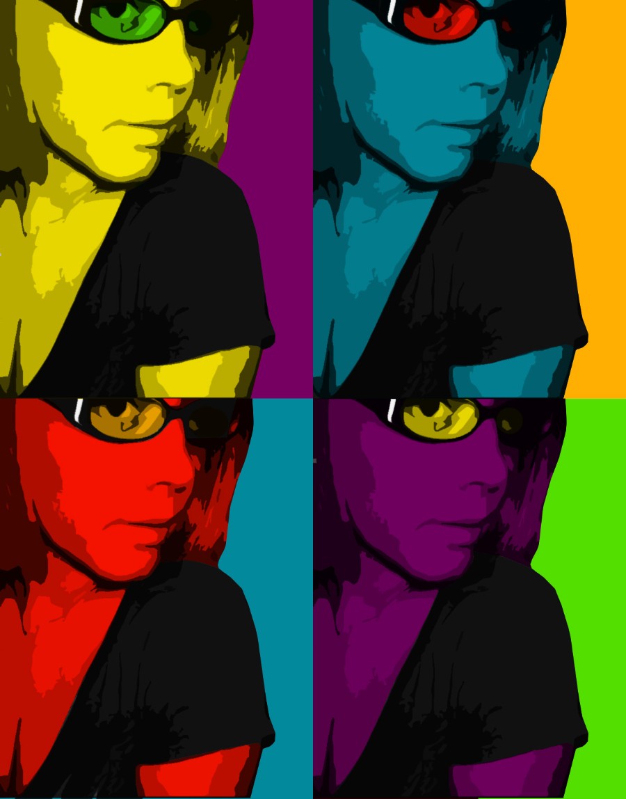
This assignment was very fun for me to do! I love color and I love messing with color combinations and this assignment let me do just that. I mostly messed with the cut-out filter in photoshop to get the blocky result in the image then I used a mulitply layer to add color. It was a fairly simple project once you figured out what needed to be done, but it did take me a while to mess with some new filters in photoshop to get the result I wanted. I am pretty happy with it and think it looks pretty psychedelic!
Assignment #2- Information Graphic
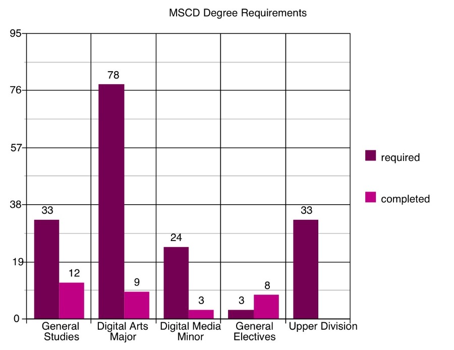
This is the graph of my required credits for my BFA in Digital Art with a Digital Media Minor. My previous major was biology and I requested to have it changed to art about 6 weeks ago but the school's system still has me under Biology. I had to make a "what-if" CPAA report in order to get the correct information. The art department was kind of sketchy on what was required for general electives credits. It only showed one empty slot for general electives and as most classes are 3 credit courses, I just assumed that 3 credits was the requirement; it also said I had met those conditions with 8 credits.
This is only my second full time semester (I was part-time last semester with only 2 classes) so I still have a long way to go!
Assignment #1- Composite with Masks.
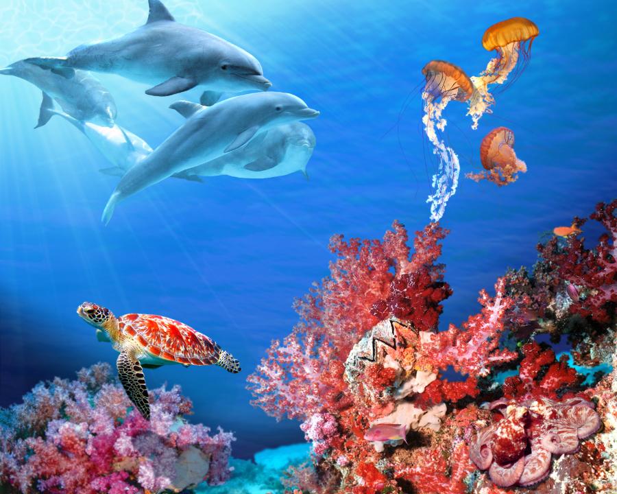
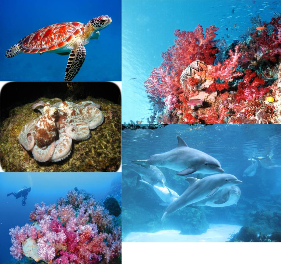
With this image I just really wanted to show the beauty of the ocean as it has always been a fascination with me. I love sea creatures as they are often very beautiful and can also be strange and scary at the same time. But there is such a wide variety of sea life so I tried to find some that represented the characteristics that I just listed. I feel that I was able to do that pretty well with the bright, beautiful images that I was able to find and use. My ultimate goal was to make the scene as realistic as possible.
There were 9 separate images that I used to make this piece. Those being the 3 individual coral reefs that make up the bottom, the octopus, the sea turtle, the dolphins and each jelly fish was from 3 different images. I also used images of water to help make the water texture in the image. As I said, my ultimate goal was to make the image look as real as possible so I spent a lot of time tweaking things to try and make it look more like a photograph than a manip.
A lot went into the process of making this image. I first had to cut out each image from their underwater surroundings, which proved to be difficult at times since the magic wand tool tends to pick up the blues in the objects I want to keep as well. So, it took some fine tuning to get the desired cut out that I wanted. Once I had the cut outs on the image, I went in and blended the edges a bit to keep it from "jutting out" in the image. When I placed the octopus in his area, he stuck out really badly, so I messed around with the color adjustment to make him more red and he blends in much better now. You could almost miss him now in fact. With the jellyfish, their tentacles were so thin that the mask often took them out completely, so I had to draw in the parts that were missing. I feel that everything blends into the image pretty well except for that darn turtle! That image had a higher res than the others so he kinds of sticks out a bit. I tried to blur him down to help but he's still pretty prominent. Lastly, I added some shadows with my creatures to make it seem like they were part of the image.
Lastly, the water. The water was first done with just flat colors on one layer. I used to gradient tool to make the colors blend better. I found some images of rippled water on a texture site and I set the layers to "overlay" on top of the color layer then I turned down the opacity to my desired level. I also messed with the color levels as well to help it blend in better. As far as with the lighting effects, those are from brushes I found on Deviantart. One being a light beam brush and the other being a water reflection brush. The lighting effects layer was set to "soft light" and the opacity was turned down as well.
Images Used